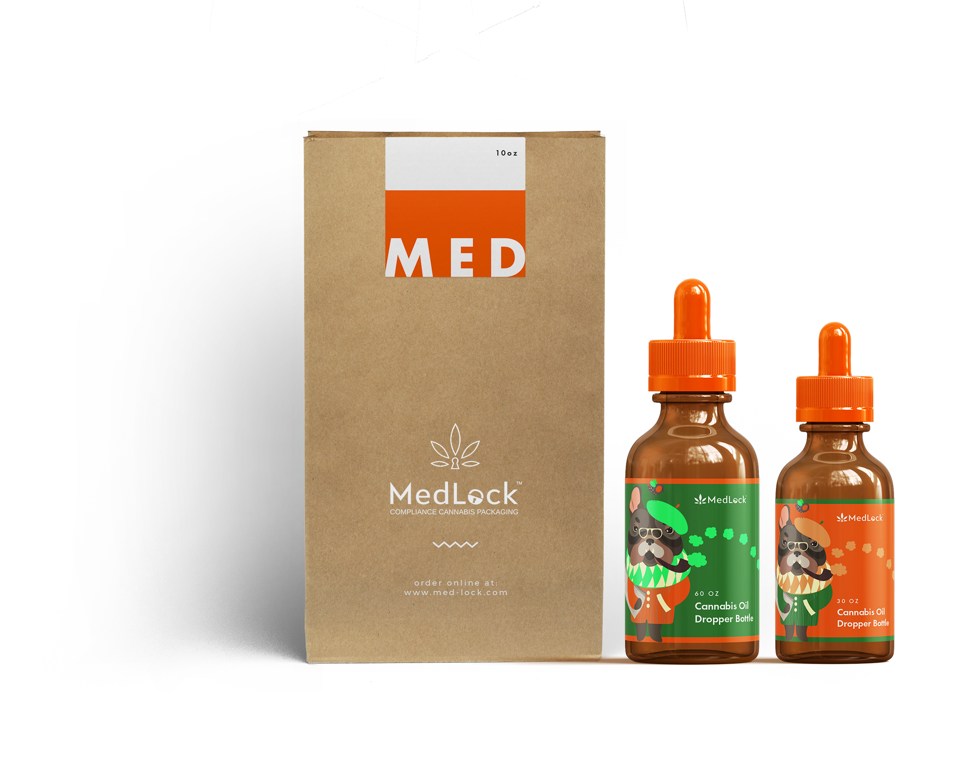
MedLock is a startup aiming to provide compliance packaging solutions for the cannabis industry.
Visit WebsiteA medical packaging startup with innovative, patented tamper evident & child resistant packaging solutions. MedLock is a daughter company of established packaging giant LiquiMedLock, looking to take the cannabis industry by storm.
MedLock came to us requiring a brand identity as well as an exciting online presence to promote and sell their innovative packaging solutions. We also needed to design renders for their three different product lines and tradeshow design, including booth display design to sell their products.
MB Creative worked with MedLock Compliance Cannabis Packaging over a long period, helping define their brand and the visual characteristics of their products. Their new website, showcasing their bottles, containers & jars, and the company launched in March 2018.
Work with MedLock to help build and grow their startup through strategy, design, creative and marketing initiatives.
We helped MedLock establish their brand and design strategy. Our initiatives allowed us to crush the goals prioritized together during strategy, and established them as a market leader for cannabis packaging solutions.
MBC's Chief Strategist Matt Balshin sat down with CEO Jack Finkelstein and the team at LiquiMedLock Inc. (The parent company of startup MedLock), to craft the brand's strategy to enter the marijuana vertical, in anticipation of the upcoming law changes in Canada. Over a two-day session, Matt surfaced challenges the organization faced with their startup. In the process, they prioritized the needs and goals of their brand and its potential customers. This became the foundation for our branding, marketing and design plans for their entrance into this new business space.
Medlock's customer base is wholesale buyers. Though cannabis smokers may be the end users, their target customers are wholesale packaging buyers. Big and small licensed producers and dispensaries looking for affordable packaging options for their products. To understand the needs of these customers, we created unique user profiles to represent the range of potential buyers. This painted a clear picture of their demographics, psychographics, wants and needs.
To be recognized globally as an innovative leader in cannabis packaging solutions. Medlock enhances your value by supplying our tamper evident-child resistant products used to ensure that customers and minors are well protected.
Understanding what the MedLock organization is and who they are serving, helped define the positioning statement of the brand. This set the tone for everything we designed, developed and created for MedLock.
We started off by laying down the foundation for the MedLock brand. A distinct vibrant orange to match their tamper evident bands and parent brands colours, and a subtle hint of green to represent the cannabis industry. A elegant but muscular typeface, helped create a voice that's authoritative, but friendly, with sense of security.
The MedLock brand identity and website were built using three different modern, sleek typefaces. Their branding began with a custom font face named 718 used to accentuate the M in MedLock. We combined 718 with a beautiful Arimo typeface used to create their logo slogan. For the MedLock website we used the popular Open Sans typeface to make things easy to read, while maintaining a modern beauty.
Style
The MedLock logo is a representation of their connection to the cannabis industry & their click lock packaging solutions. It incorporates a cannabis leaf & lock to showcase MedLock's product industry and focus on secure packaging solutions.
For business cards, we crafted a vertical concept with a minimalist design. Orange on the back and a grey on the front. These business cards were designed for MedLock's parent company LiquiMedLock Inc.
Establishing MedLock's brand, business cards and print artwork was a long, hard-working team effort, that was loads of fun. Tons of collaboration and amazing ideas led to what you see today.
Antonijo Rop
Lead Product Designer
MB Creative was asked by MedLock to design a display booth, podium & rack for their upcoming tradeshows, namely the 2018 Lift Expo. Our result, a minimalist design to showcase their one-step click lock closure & open packaging solutions, and their brand uniqueness.
MB Creative worked with MedLock to design product renders. Our designers worked to mockup three different product lines: glass & plastic oil bottles that come with two different cap options, flower jars, & tablet containers. We designed these bottles in many colours & sizes. This process took several months & included many rounds of revisions to get all the intricate details in place.
MB Creative was tasked with creating an e-commerce website to showcase and sell MedLock's products. The e-commerce solution is powered by WooCommerce and is running on WordPress.
The MedLock website was designed to be fully responsive giving shoppers the optimal experience, no matter their device screen size. All websites MB Creative designs are fully responsive to work perfectly on desktops, tablets and mobile devices, and provide the best possible user experience.
We've been working with MB Creative since 2016 when they redesigned our LiquiMedLock website. For MedLock we teamed with MB Creative to establish the entire brand identity. From logo, print artwork, flyers, business cards, an ecommerce website, social media, you name it, MB Creative has been there to create our entire digital appearance. They even designed our products!
Jack Finkelstein
MedLock CEO
MedLock compliance cannabis packaging was a project brought to us by our client LiquiMedLock Inc. They contacted us about their startup MedLock for us to design their brand & identity, website, tradeshow artwork & social media pages. In the end, the launch of the MedLock brand was a massive success, and they have quickly become an industry giant.


